Wednesday, December 5, 2012

Final Project Research

From the beginning of the process of making my final project I knew that I wanted to focus on primary colors in their simplest form. Red, yellow and blue have just resonated with me as of late. When thinking of simple use of primary colors, Piet Mondrian's 1923 painting Composition A immediately comes to mind.  
 
 
I have always debated whether or not I actually like this painting. I mean it is so basic that it makes you wonder if it is even actually "art." It did not require a great deal of skill or technique. Yet still it is an image that sticks with me, and that alone intrigues me. Mondrian created such a simple image that it has found highly influential and recognizable place in art and society.
 
I knew that I aslo wanted to incorporate my fabric pieces and the "paper cave" piece that I had done earlier in the class. These 3D materials finding their place on the gallery wall made me think of the work of Robert Rauschenberg. Two pieces he did that I always find myself coming back to are Bed and Monogram. In these works he incorporates the 3D in an interesting way. One has a "bed" attached vertically to the wall and paint splattered on it and the other a painting laid flat on the ground with a taxidermy goat standing on it and once again painted on. Looking into more Rauschenberg artwork I found his piece Minutiae. This is the piece pictured below with different colored fabric swatches. I really love how he took something so simple and made it somehow intriguing.
 
 
My last piece I wanted to incorporate in my final was my "waterfall" I had made. I had the idea of suspending it by wire and this seemed some how whimsical. I searched the web and found these wonderful digital pieces by Alexander Jansson. The one below shows a little bit of what I was going for. Something similar to it at least.

Sunday, December 2, 2012

Final Project


For the Final Project I went through all of my Quick Challenge work and picked out my favorite pieces. The ones I liked best were my Sandpaper Painting of the mountains, the Paper Cave, my Waterfall Island, and my Cloth Color Swatches. I then looked for ways to connect all these different works. I found similarities in color and form. I wanted to create a sense of organized chaos. I like symmetry and balance, but I also love randomness. For some reason this semester I have really enjoyed working in primary colors. I love how bright and vibrant they are. For each piece that I picked from the Quick Challenges I created at least one new piece related to it in order to create balance.

 
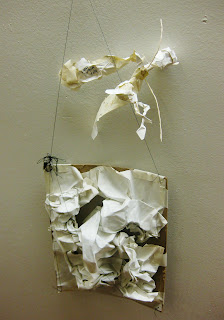
Waterfall Island suspended by wire. Made with card paper, paper towell, balsa wood, gel medium modeling paste and paint.

Tree suspended by wire. Made the same way as the Waterfall Island. The branches are tape over wire.
 
 
Balsa Wood Color Study.


The Killers Mountains

Yes It's an Ice Age

 
Primary Fabric

Papa Paper Cave


Baby Paper Cave

Friday, November 30, 2012

Quick Challenges Laid Out

 These are pictures from when all of my quick challenge work was laid out for the class to go through and come up with ideas for the final project.


Conversation

It seems to be a common theme in my blog to start out by saying it took me a while to get ideas going for each project. So for the Conversation piece, I am going to do just that! I had a very hard time deciding what to do for this one. My interview ended up being very strange. My character I created was a pirate named Iron Roger, but in the interview I was asked questions like how much wood could a woodchuck chuck or something about pancakes in the Russian summer sun. So I was left unsure of where to go from there.
 
 
Initially I was going to make a book based on the super random journey of Iron Roger and his crew.

 
It would be illustrated and on weathered and burned paper of course. Using tidbits from the interview worked into a somewhat intelligible story.


There was something about whale blubber in the interview so I thought this would be fitting. However, I couldn't figure out how to finish the story and and I didn't want it to seem incomplete or rushed, so I got burned out on this idea.

 
After that I cut out the entire interview into half inch strips and glued the strips together on end creating a really long rope of interview paper. I rolled it up and burned some more edges and then decided it would be a good idea to put the roll into home made ocean (water, salt and sand in a cup). Not sure where I was going with this I took a few pictures.


When I pulled out the roll, the salt water had unstuck some of the glue and I was left with a strange mess. It kind of resembled seaweed which I thought was somewhat fitting I guess. I then created a package with weathered paper and labeled it "Square of Turtle's Tail" which was taken from the interview. I fastened it with burned tape and that  was what I initially turned in.

It was not received well.
 
So then I decided to pull apart each piece of interview paper strip and glue them onto a piece of cardboard coating the surface in a weathered lined surface with random words. I decided to draw Iron Roger on this surface and wanted to make it random like the interview, so I didn't want him to be an ordinary pirate. That is why he has on octopus face, one dinosaur head, and a regular man's face all at once. He also has a zombie hand. I filled in the drawing with gouache. Last I added a couple images from my initial book idea sketches, the ship leaving Africa in the top right and the man harpooning the whale at the bottom.

 
And that is that.
 

Reflection

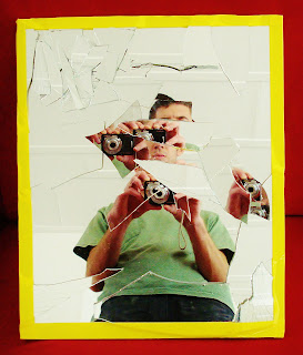
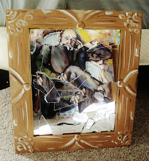
I had a lot of trouble with the Reflection assignment. I had a mirror, and that was about it. I didn't know what to do with the mirror. I decided to smash it up, and then I tried to put it back together and have planes facing in odd directions to get weird reflection. This is how that turned out:

 
It didn't turn out as amazing as I had hoped.
 
So then I decided to create a frame for the broken mirror out of painted cardboard. I taped the frame to the mirror and decided to take pictures of the mirror in interesting locations. The photos would now become the final piece rather than the mirror itself. Which is good because the mirror is pretty clunky.
 
Fence and House

Sky House


Warm Cool

Speed Limit 10

Bicycle

Shape Shape Painting

Duchamp's Dad Painting
 
I am pretty satisfied with the end product. I think the photos turned out pretty neato.

Tuesday, October 23, 2012

Found Objects

Finding objects proved to be more of a challenge than I had anticipated. It took me a long time to find my first object. It ended up being a shell on the beach. I found a few other shells that day and then I began to pick up little objects here and there. I ended up with 14 total found objects and I decided that my response drawings would be characters based off of the objects. I decided that I only wanted to use natural organic objects and nothing man made. I drew up some sketches then narrowed it down to six final objects. Here they are:
 
A Shell

A Berry

A Walnut

Pine Needles

A Palm Leaf

A Leaf
 
Here are the objects that did not make the cut:
They are Rolly Glasses, another Leaf, another Shell, a Feather, Coral, Business Card, an Oil Pastel and a Granny Smith Apple Sticker.
 
For my responses to the objects, I decided to create a character to go with each item. Here are my drawings.
 
A Shell Frog
 
A Berry Head
 
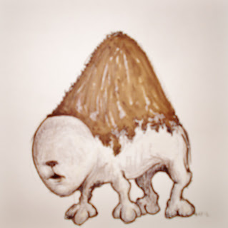
 A Walnut Buffalo
 
Pine Needles Man
 
A Palm Leaf Skeleton

A Leaf Man